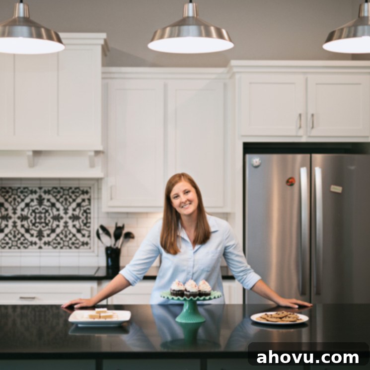
Our New Home Tour: Modern Farmhouse Design, Decor Ideas, and Paint Colors
Happy Monday, friends! While I typically focus on sharing delicious recipes with you all, today marks a special occasion where I’m stepping away from the kitchen a bit to share something much more personal and equally exciting. Earlier this year, I briefly mentioned that Josh and I embarked on the incredible journey of building our new home. Over the past few months, we’ve poured our hearts into getting settled, decorating, and personalizing every corner. Now, after much anticipation, I’m absolutely thrilled to open our doors and share a comprehensive photo tour of our new custom-built house.
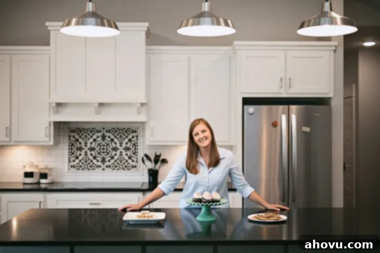
Choosing just a few pictures to represent months of dreaming and hard work was surprisingly difficult, so I decided to go all-in and share an extensive look at nearly every space. This includes a detailed glimpse into our kitchen, living room, a selection of bathrooms, and even the often-overlooked but highly functional laundry room. Beyond the visuals, I’m also delighted to share all the specific paint colors and details about the materials we chose. I vividly recall how helpful such specifics were when we remodeled our last house, and my hope is that this information proves equally valuable to you as you plan your own home design projects or renovations.
And for those eagerly awaiting new culinary creations, please feel free to bookmark this post for later. I’ll be back next week with a fresh, delicious recipe just for you!
The Heart of Our Home: A Modern Farmhouse Kitchen Design
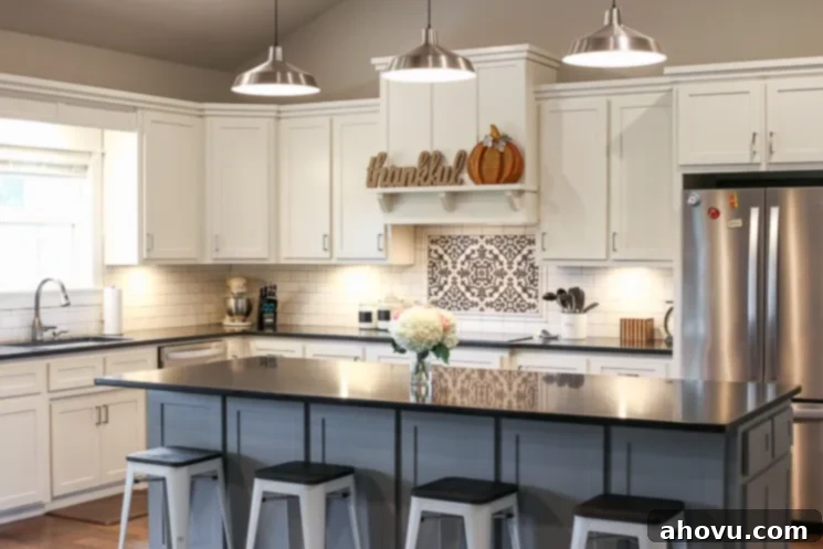
Without a doubt, the kitchen holds the title of my absolute favorite part of our new home. This space was designed with both aesthetics and supreme functionality in mind, especially given my passion for cooking and baking. Our previous home suffered from a severe lack of counter space, often forcing me to commandeer the stovetop just to prep meals. A non-negotiable requirement for our new build was an abundance of workspace. For the countertops, we selected honed Absolute Black granite. It offers a sophisticated, understated elegance – not overtly shiny like polished granite, but also not as stark as a matte finish. While it certainly encourages us to keep surfaces pristine (a fun challenge, really!), its beauty makes the effort entirely worthwhile.
Storage was another top priority. We maximized every opportunity, including clever extra storage hidden on the back of our spacious island. One of my favorite features in the island, however, are the discreetly placed outlets. This design choice has been a game-changer! I can effortlessly move my stand mixer or other small appliances to the island, plug them in, and enjoy an expansive, dedicated area for all my baking and cooking endeavors. These outlets are ingeniously hidden behind small doors on the sides of the island, maintaining a sleek and uncluttered look for the backsplash.
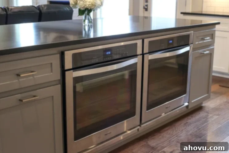
As a food blogger, the need for double ovens was paramount. For nearly four years, I managed with a single oven, which, to put it mildly, was often a major pain point, especially when tackling large batches of cookies or cupcakes. The kitchen’s layout initially presented a challenge for a traditional stacked double oven. However, Josh brilliantly suggested integrating two single ovens into the island. After exploring similar concepts online, I was completely sold on the idea, and it has proven to be an incredibly functional and stylish solution.
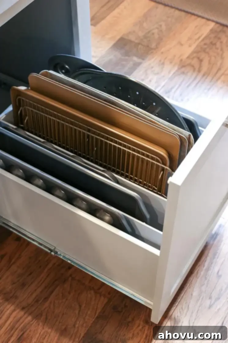
Adjacent to the ovens, we designed a custom drawer with built-in dividers specifically for my baking pans and sheets. Its proximity to the ovens makes it incredibly convenient, streamlining my baking process. On the other side of the ovens, a matching drawer serves as our integrated trash and recycling center – a feature I highly recommend for keeping waste out of sight and maintaining kitchen cleanliness.
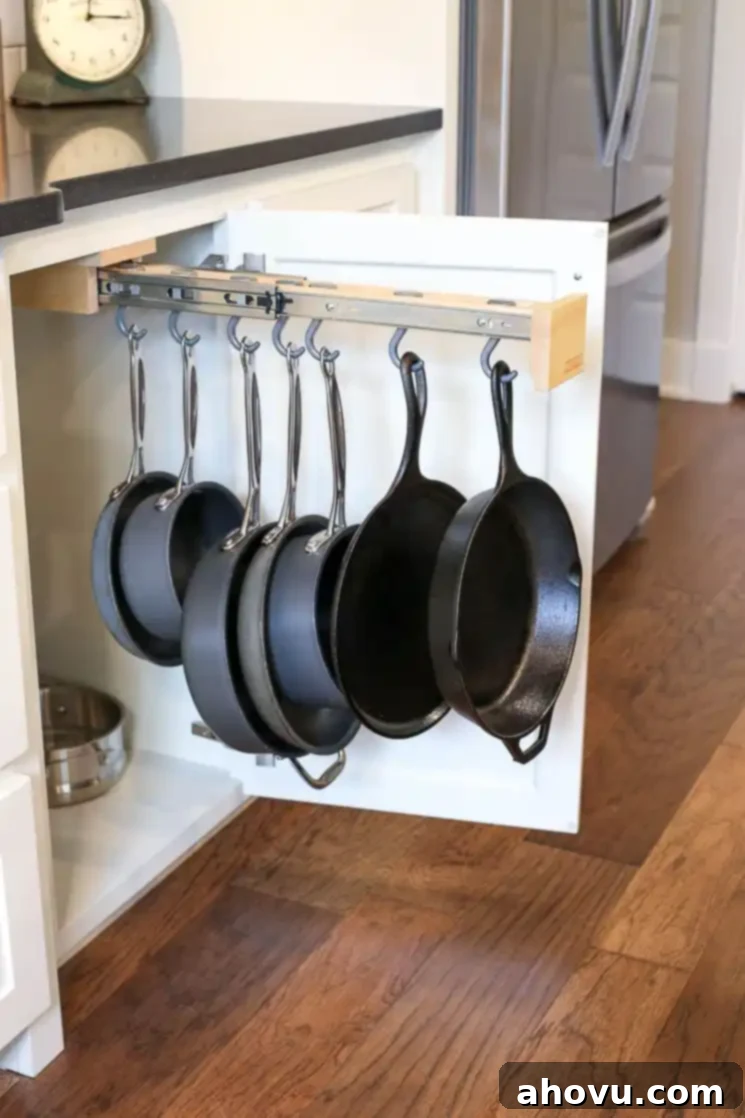
Another ingenious feature we incorporated into our kitchen design is a hidden pot hanging rack, tucked away inside a cabinet door right by our stovetop. This pull-out rack makes grabbing a skillet or saucepan incredibly handy, keeping frequently used items easily accessible yet out of sight for a clutter-free appearance.
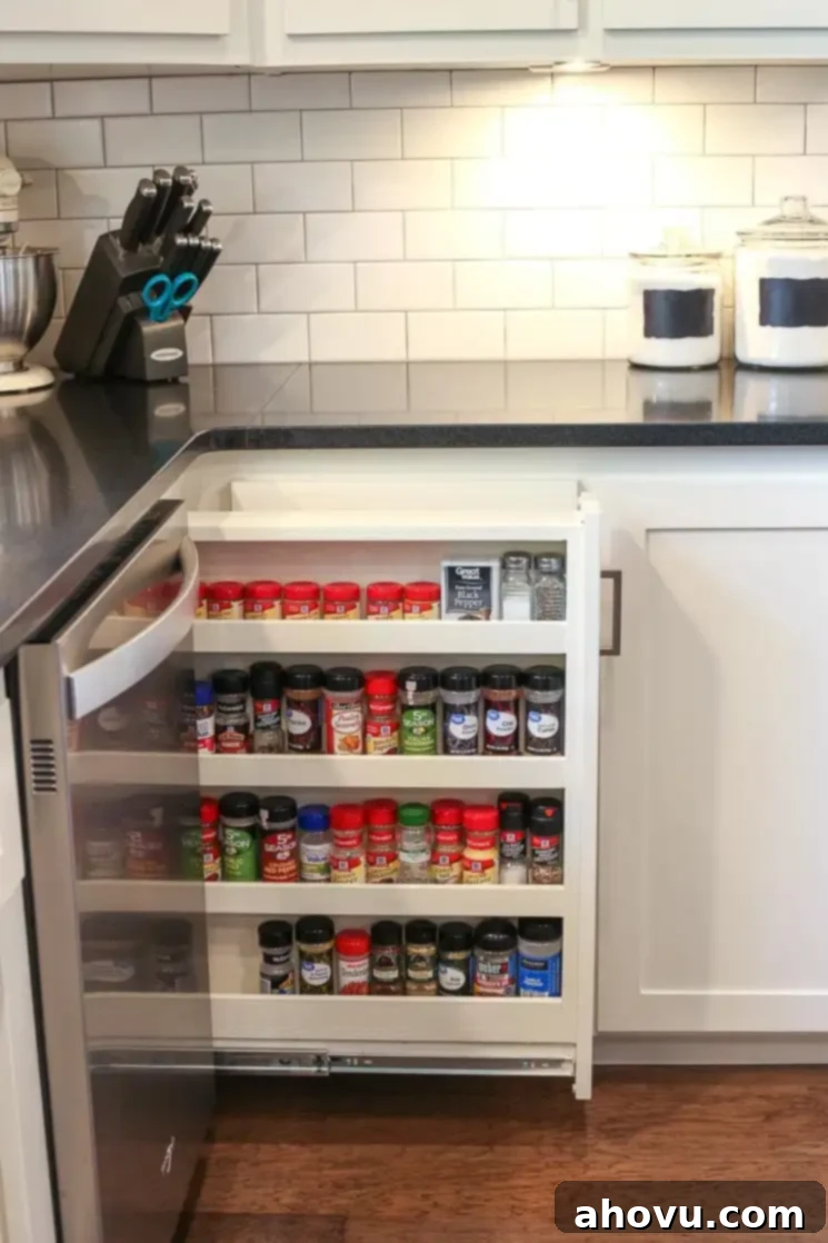
The final, and perhaps most cherished, kitchen addition is our pull-out spice rack drawer. During the cabinet planning phase, we discovered a small, seemingly unusable “dead space” next to the dishwasher. Our contractor initially suggested a false door, but I inquired if it could be repurposed for a spice rack. Fortunately, it was just large enough, and I absolutely adore it! Gone are the days of spices getting lost in the back of a lazy susan. This organized rack makes every spice easy to find and grab, transforming a previously awkward spot into a highly efficient storage solution. If you find yourself with a small, unused space in your kitchen, I wholeheartedly recommend considering a similar custom feature.
You may also notice the absence of traditional outlets along our kitchen backsplash. This is by design! They are cleverly hidden underneath the cabinets, seamlessly integrated with our under-cabinet lighting. This detail creates a wonderfully clean and uninterrupted backsplash, enhancing the overall aesthetic of our kitchen.
Kitchen Design Details
- Wall color: Repose Gray – Sherwin Williams (A perfect true gray, used throughout much of our home!)
- Cabinet Color: Alabaster – Sherwin Williams (A warm, inviting white that brightens the space)
- Island Color: Metal Chi – Kelly Moore (A grounding, rich gray that complements the overall scheme)
- Counter Tops: Absolute Black (Honed) – Durable and elegant, offering a subtle sheen
Our Open-Concept Living Room: Comfort and Style
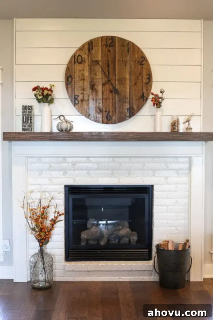
Our living room seamlessly flows from the kitchen, creating an inviting open-concept space that’s perfect for both entertaining and everyday family life. While we’re still adding those final touches and personal decor elements, the centerpiece of this room is undoubtedly our stunning fireplace. We chose to have the bottom half bricked and painted a crisp white, providing a beautiful textural contrast. Complementing this, custom trim matching the rest of the house frames the fireplace, topped with a gorgeous stained and distressed mantle. Above the mantle, we opted for classic shiplap, which adds to the modern farmhouse aesthetic. The large clock adorning the fireplace was handcrafted by Josh from reclaimed pallet wood, a truly special and personal touch that I absolutely adore.
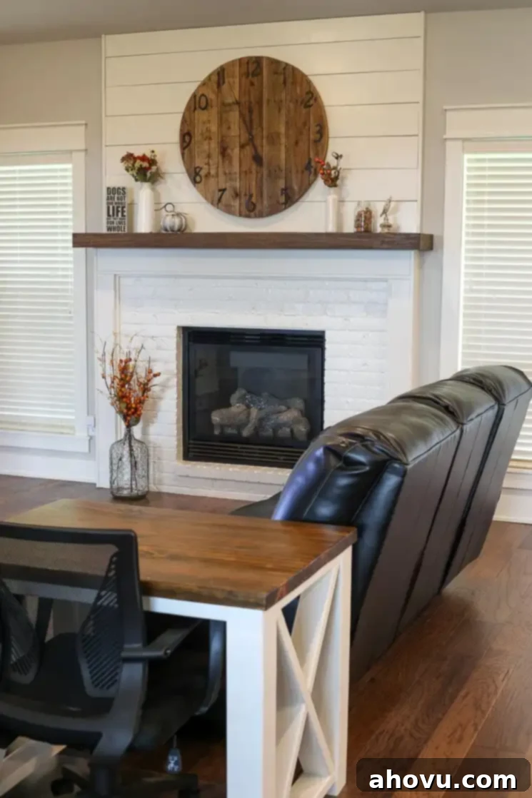
Flanking the fireplace are large windows that offer beautiful views of our backyard, bringing in natural light and a sense of connection to the outdoors. On the left side, we have a small entertainment center with our television. We plan to upgrade to a larger unit that better complements our home’s design, but for now, our trusty old one serves its purpose. To complete the cozy feel, I’m envisioning a soft rug and a stylish coffee table to anchor the seating area (it still feels a bit bare, so any rug suggestions are warmly welcome!). The charming desk by the couch was also a custom build by Josh. As I now work from home, I appreciate the flexibility of working in the living room, allowing me to enjoy the backyard view or have the TV on for background ambiance. A comfortable loveseat, matching our main couch, is situated to the left of the desk, providing additional seating.
Welcoming Guests: Our Entry Way and Dining Room
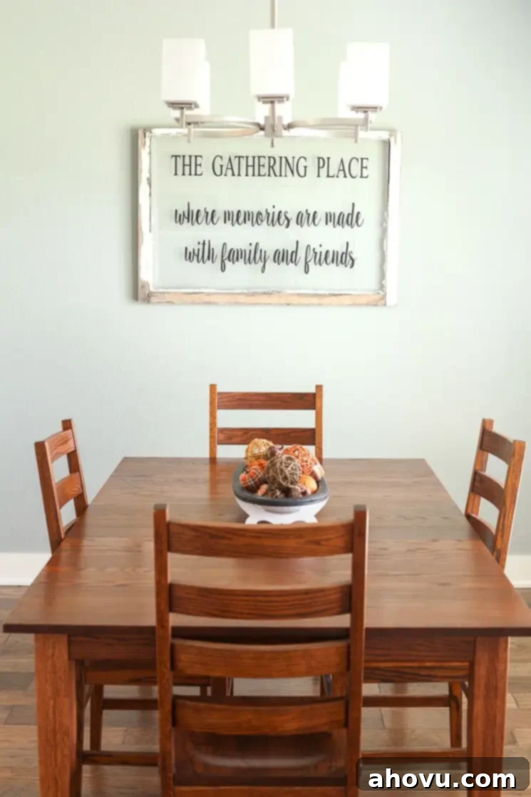
The dining room and entryway maintain an open, flowing connection to both the kitchen and living room, creating a cohesive and spacious feel throughout the main living areas. While defined by walls, their open transitions ensure a sense of continuity. We are currently using our old dining room table, but we have plans to find a new one that perfectly aligns with the modern farmhouse aesthetic and overall design of our new home. We envision a piece that will become a focal point for family meals and gatherings for years to come.
Dining Room Design Details
- Wall Color: Oyster Bay – Sherwin Williams (A soft, serene green-gray that adds a touch of calm)
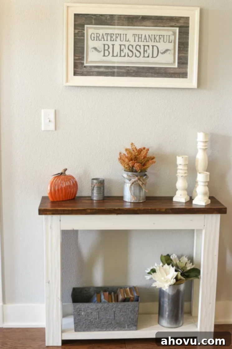
Our entryway is graced by this adorable farmhouse-style entry table, another beautiful creation by Josh. He expertly distressed it to match the cohesive color palette and rustic charm found in the living room’s fireplace and desk. The wall color in the entryway, like much of our main living space, is Repose Gray from Sherwin Williams. If you’re on the hunt for a true gray that avoids overly brown, blue, or green undertones, I cannot recommend Repose Gray enough. It’s truly a versatile and elegant shade that ties our home’s aesthetic together beautifully.
Thoughtfully Designed Bathrooms: Functionality Meets Style
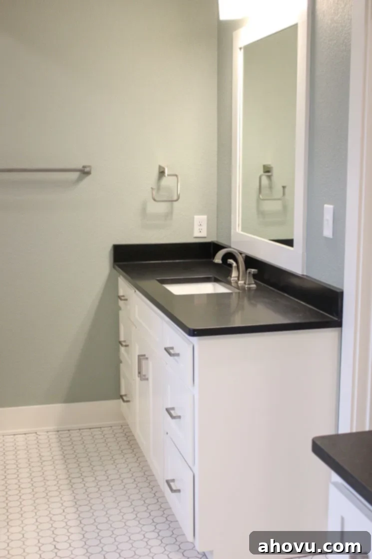
Our home boasts two full bathrooms and a convenient half bathroom, each designed with a consistent aesthetic that promotes a sense of tranquility and cohesion. We maintained the same classic white cabinet style and elegant black granite countertops throughout all the bathrooms, ensuring a unified look. For the full bathrooms, we carried over the serene Oyster Bay wall color from the dining room. The flooring features a timeless white hex tile with a subtle dot, adding character without overwhelming the space.

In the showers, we extended the same white hex floor tile, complemented by crisp white subway tiles on the walls, creating a clean and classic appeal. Our second full bathroom mirrors this design in terms of colors and tiles, though with a different layout. This bathroom conveniently functions almost like a Jack and Jill, connecting to our two back bedrooms. We also wrapped the luxurious whirlpool tub in the same black granite and added charming shiplap around its base, enhancing the modern farmhouse feel. Our main bathroom also features separate vanity counters, with Josh’s space thoughtfully located on the opposite side for personal convenience.
Full Bathroom Design Details
- Wall Color: Oyster Bay – Sherwin Williams (A soothing green-gray for a spa-like atmosphere)
- Cabinet Color: Alabaster – Sherwin Williams
- Counter Tops: Absolute Black (Honed)
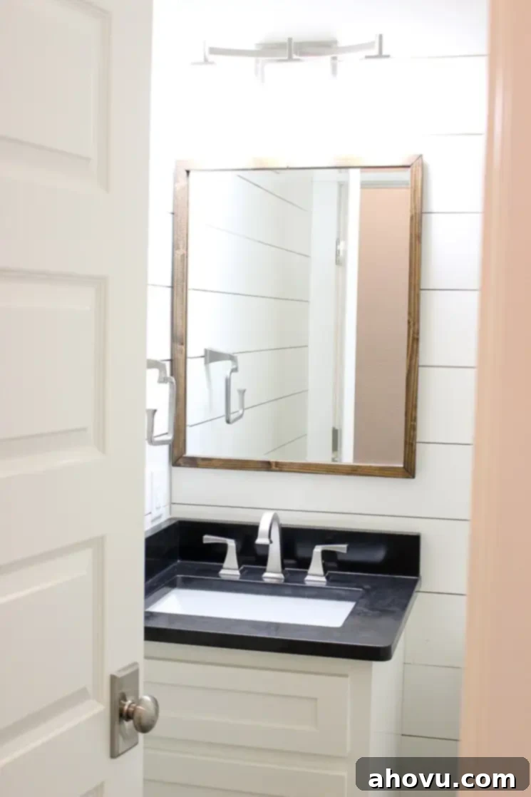
For the half bathroom, we aimed for a slightly different, more impactful design while ensuring it still harmonized with the rest of the house. We maintained the continuity with the same countertops and cabinets but opted for a bolder statement by adding shiplap to all the walls. This creates a beautifully textured and inviting space. I’m excited to enhance this room with some small shelves and vibrant, colorful decorations to elegantly break up the striking white and black palette. Please note, this particular photo was taken before we fully moved in, which explains the slight dust on the countertops.
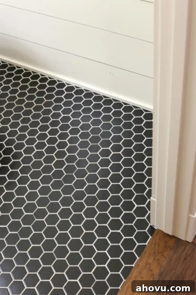
The flooring in the half bathroom also features hexagon tiles, but we inverted the color scheme with striking black tiles and contrasting white grout. The result is a bold, modern, and incredibly chic look that I absolutely love!
Half Bathroom Design Details
- Wall Color: Alabaster – Sherwin Williams (A crisp white that enhances the shiplap texture)
- Cabinet Color: Alabaster – Sherwin Williams
- Counter Tops: Absolute Black (Honed)
Our Efficient and Stylish Laundry Room
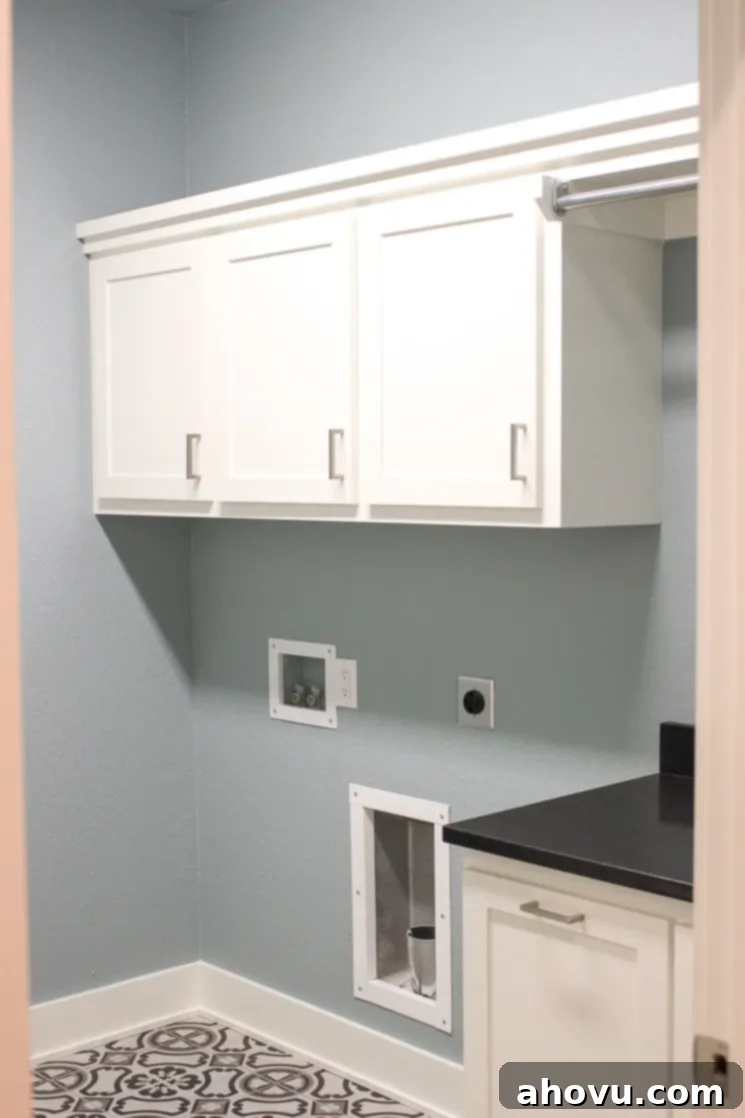
In our laundry room, we sought a balance between durability, low maintenance, and a specific aesthetic. I was drawn to the look of concrete tiles but preferred to avoid the upkeep often associated with them. Our solution was to select porcelain tiles that beautifully mimic the appearance of concrete, offering the desired industrial-chic style with practical benefits. For the walls in this functional space, we chose a lovely gray/blue color. The harmony between the wall color and the tile flooring creates a serene yet refreshing atmosphere, making laundry tasks a bit more pleasant. This photo was taken prior to our full move-in, but it’s now home to our washer and dryer, completing its purpose.
Laundry Room Design Details
- Wall Color: Dutch Tile Blue – Sherwin Williams (A calming blue-gray that pairs beautifully with the tile)
Craftsman Details: Doors and Trim Throughout Our Home
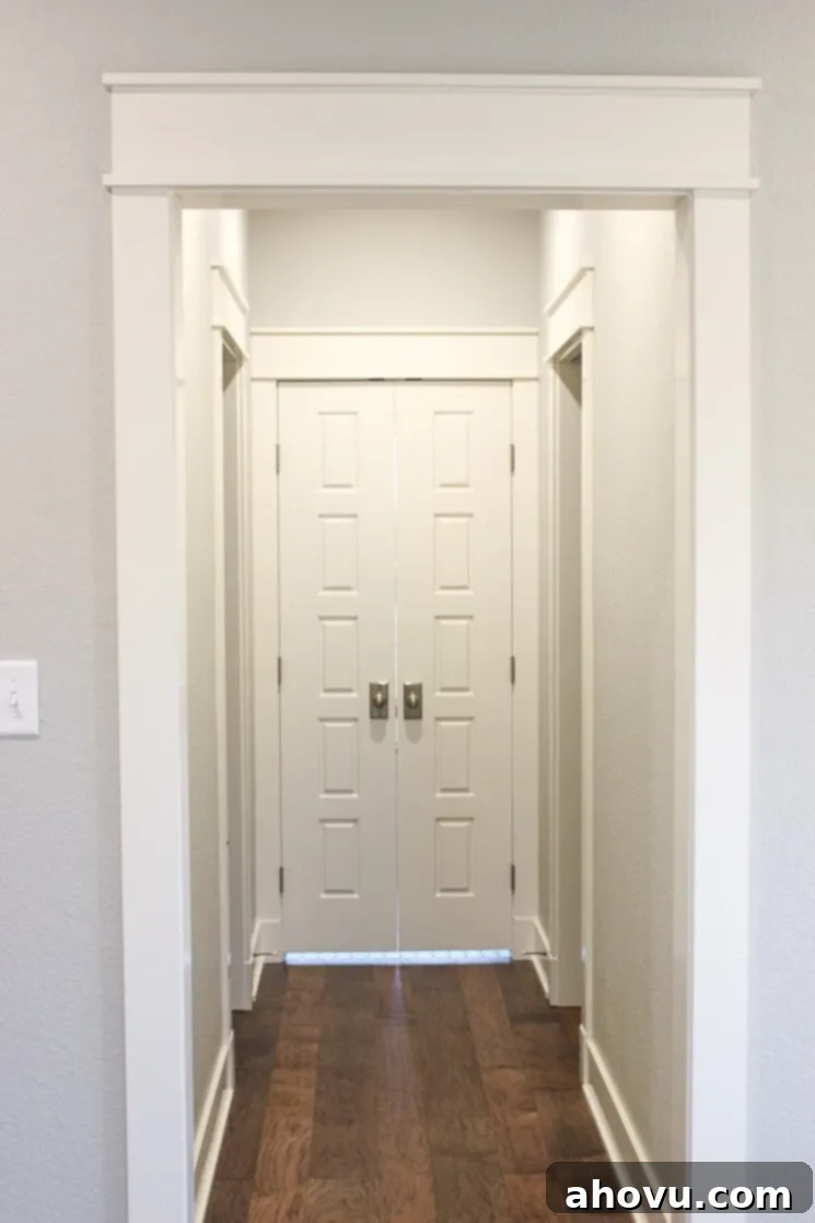
Given that the exterior of our home embraces a traditional Craftsman style, we were keen to carry this timeless aesthetic indoors. This meant opting for a more square trim profile over a molded version, which perfectly complements the architectural integrity of the house. We also chose thicker baseboards, a detail I absolutely adore for its classic appeal and presence. The same consistent trim and door style has been meticulously applied throughout the entire house, ensuring a cohesive and sophisticated finish in every room.
This particular image captures a view from our bedroom, with the hallway leading to our en-suite bathroom. The two smaller doors you see on each side are the entrances to our closets. While they appear open in this picture, we’ve installed convenient pocket doors on them to maximize space and maintain a streamlined look in our private sanctuary.
Door and Trim Details
- Trim/Door Color: Alabaster – Sherwin Williams (A consistent, clean white that brightens and defines spaces)
I truly hope you’ve enjoyed this detailed tour of our new home. It was quite a challenge to narrow down the pictures and decide what to share, but I wanted to offer a truly comprehensive look at our journey. I plan to share more personal posts like this from time to time, delving into other aspects of home life and decor. If there’s anything specific you’d love to see or any questions you have about our design choices, materials, or even decorative elements, please don’t hesitate to ask in the comments below! Your input and questions are always welcome.
Have a wonderful and inspiring week, friends!
– Danielle
